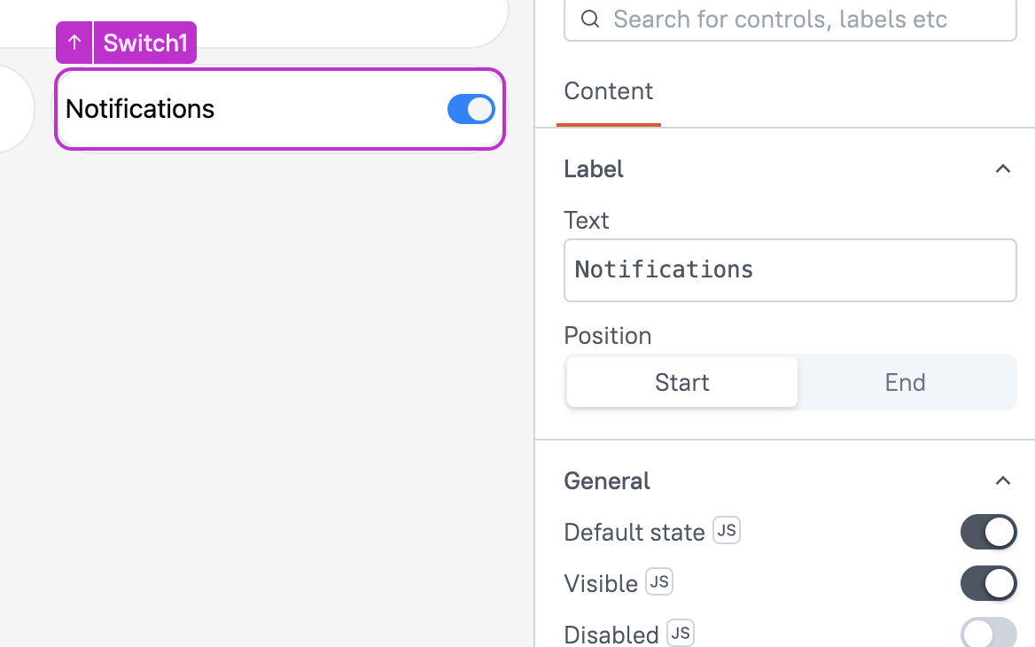
Switch (AI Assistant)
This page provides information on using the Switch widget, which represents a boolean value. It allows users to toggle between two states: true (on) and false (off). The switch is commonly used for binary choices like enabled/disabled or on/off.
This widget is only available in AI Assistant Apps and cannot be used in Classic Apps.

Content properties
These properties are customizable options present in the property pane of the widget, allowing users to modify the widget according to their preferences.
Label
Text string
Sets the label for the Switch widget. This text is displayed alongside the switch, providing context to the user about its functionality.
Position string
Allows you to choose the placement of the label relative to the Switch. You can choose:
- Start - Aligns the text to the left of the Switch.
- End - Aligns the text to the right of the Switch.
General
Default State boolean
Specifies whether the Switch is initially set to "on" or "off" when the widget is loaded.
Visible boolean
Controls the visibility of the widget. If you turn off this property, the widget would not be visible in View Mode. Additionally, you can use JavaScript by clicking on JS next to the Visible property to conditionally control the widget's visibility.
For example, if you want to make the widget visible only when the user selects Yes from a Select widget, you can use the following JavaScript expression:
{{Select1.selectedOptionValue === "Yes"}}
Disabled boolean
Prevents users from selecting the widget. Even though the widget remains visible, user input is not permitted. Additionally, you can use JavaScript by clicking on JS next to the Disabled property to control the widget's disable state conditionally.
For example, if you want to allow only a specific user to fill the input, you can use the following JavaScript expression:
{{appsmith.user.email=="john@appsmith.com"?false:true}}
Animate Loading boolean
This property controls whether the widget is displayed with a loading animation. When enabled, the widget shows a skeletal animation during the loading process. Additionally, you can control it through JavaScript by clicking on the JS next to the property.
Events
onChange
Allows you to define a set of actions that would be executed in response to the switch state change.
Reference properties
These properties are not available in the property pane, but can be accessed using the dot operator in other widgets or JavaScript functions. For instance, to get the visibility status, you can use Switch1.isVisible.
isSwitchedOn boolean
The isSwitchedOn property retrieves a boolean value that indicates whether the switch is turned on. It returns true if the switch is on and false if it is off.
Example:
{{Switch1.isSwitchedOn}}
isDisabled boolean
The isDisabled property reflects the state of the widget's Disabled setting. It is represented by a boolean value, where true indicates that the widget is not available, and false indicates that it is enabled for user interaction.
Example:
{{Switch1.isDisabled}}
isVisible boolean
The isVisible property indicates the visibility state of a widget, with true indicating it is visible and false indicating it is hidden.
Example:
{{Switch1.isVisible}}
Methods
Widget property setters enable you to modify the values of widget properties at runtime, eliminating the need to manually update properties in the editor.
These methods are asynchronous and return a Promise. You can use the .then() block to ensure execution and sequencing of subsequent lines of code in Appsmith.
setVisibility (param: boolean): Promise
Sets the visibility of the widget.
Example:
Switch1.setVisibility(true)
setDisabled (param: boolean): Promise
Sets the disabled state of the widget.
Example:
Switch1.setDisabled(false)
setRequired (param: boolean): Promise
Sets whether the widget is required or not.
Example:
Switch1.setRequired(true)
setValue (param: boolean): Promise
This method sets the value of the Switch widget dynamically. You can use this to programmatically change the state of the switch (either on or off).
Example:
Switch1.setValue(true)
See also
- Insert Data – Learn how to insert data into a datasource using widgets.
- Update Data – Discover how to update data using widgets.
- Create a Multi-step Wizard – See how to create a multi-step form.